After reading the part of the
Hunger Games where Katniss and Peeta beat the Capitol by defying the unwritten rules of the game, I thought that this could easily relate to people making companies or websites with a certain use in mind, only to see it changed by the users. The Capitol was furious because Peeta and Katniss turned the power of the Capitol crowds against the gamemakers—just as youtubers started pirating songs and movies on a site intended for sharing personally-shot videos. What's a site to do when its usership loves the site, but for a reason the creators didn't intend?
So, as we're thinking of ways to design our website for the LitMag, I think it's useful to think of ways that people might "defy" our structure, or ways that our structure could lead to the kind of participation we don't want. Sooo....I looked at some other litmags, or writer-workshop-type websites to see what their form told me about what they were looking for and how they wanted people to communicate with them.
The Bird Sisters:
http://thebirdsisters.blogspot.com/2011/03/literary-citizenship-by-cathy-day.html

This site has the feel of a blog, and simply by looking at the layout and design, I would guess that it's mostly a place for the blog owners to highlight authors and write treatises on writing and how to do it better. The parts of the website that clued me in were the lack of tabs (so it's more of a serial site, not an archive or browsing-type site), the picture and "about me" link on the sidebar, and the personal nature of the top blog post.
Narrative:

This homepage looks somewhat like a news website with its many banners and pictures, its cramming of a lot into as small a space as possible, and some ad-like clutter. This look leads me to believe this website is run like a corporation, and feels a bit distant from its readers. It's a bit intimidating as an author—I feel like my submissions would get lost, and would be seen by inpersonal people of a corporation, instead of a community.

Exquisite Corpse:
This looks like a text-based tabloid or newspaper with its header font and the way the sidebars, tabs, and banner are formatted. That kind of layout makes it feel more like an online publication, where works go to get presented to the world, as a kind of hyperlinked version of a physical tabloid. There are options to facebook or tweet the articles, but other than that, user interaction is at a minimum (there isn't an option for comments, at least not that I could find at a glance).
Jer's Literary Weblog:
This blog actually looks like a website, but it still retains the "flavor" of a blog because of the name and the personal profile on the side. It's interesting because this blog also sends the message that it is a disseminator of knowledge, that the content provided by the blogger is above the reader—the content is provided top-down for readers to learn from, not for them to talk about. While looking at this site, it struck me that sites that cram a lot of stuff on pages are not only overwhelming, but also discourage participation. The people behind the site seem to be saying "We have so much information to give, we can't spare a breath or a box of free space!" That message doesn't make me want to submit something.
The Orphanage:

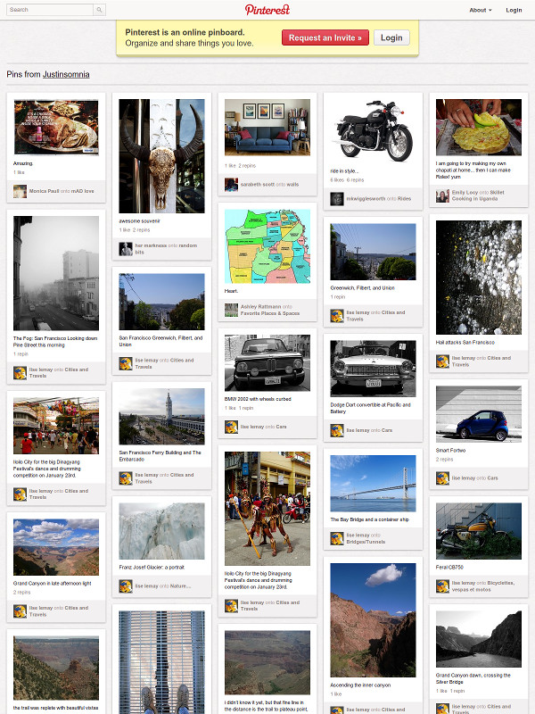
This site's homepage is simple, has tabs, and showcases some pieces with pictures at the bottom. The white space is inviting and makes the site seem more accessible. The submissions tab was readily noticeable, so I saw that this is something they want people to contribute to. There is a sense of community in that the site creators are saying "give us what other people have rejected," the authors preface their pieces with a bit about why it was rejected elsewhere, and there are many options to share the content (Fb, Pinterest, Twitter, etc.). It has a readily noticeable niche (previously rejected writing), show in the banner and the "About us" page. [Sidenote--this makes me wonder if we need to focus more on a niche to set us apart and focus our submissions more.]
How this affects how we design the website:
Our purpose is to create a community that produces, shares, and celebrates each others' art, particularly the written word. Key words: community, share, celebrate. I think the number one way we can avoid "rebellion" is by making it clear what the site is for, not only in a stated purpose, but also in how it looks and how it encourages people to interact with it.
After looking at several websites, including the ones I just talked about, I thought of several ways we could encourage people to use the website in the way we intend: to create community, share, and celebrate art.
1) Make "submissions" tab obvious.
2) Don't have "about me" sidebar—have an "about us" tab instead. We don't want to make this appear like top-down dictation.
3) Make comments available and obvious so they're essential to how the website works.
4) Avoid looking too commercial and also avoid looking too one-person-produced—a clean, inviting look is what we want. Then people can come and create a community.
5) Have white space. We want to invite people in, not intimidate them.
Any other ways we can make a website that helps people create a community where they can share and celebrate their art?
I think we should also look into how voting may backfire, since that is a function that I don't see much on other literary magazine-type sites.


